Top 5 tips for designing smooth checkout process

Today having a business without an existing website is much more like not having that business at all. More and more people strive to create their own websites and it is not only about up-to-date trends. Business owners are not the ones who appreciate the advantages of websites` creation – customers also get great benefits from it. Due to the easier access to computers and increased utilization of smartphones around the world the number of digital buyers is in constant grow. According to Statista, over 2.14 billion people worldwide are expected to buy goods and services online by the year 2021, while the global number of digital buyers in 2016 was 1.66 billion.
However, it is not enough just to have a site.
What exactly do people expect from your website? The look of your logo, fonts and beautiful images? That all is important but still not enough.
Best there is a combination of both look and usability of a website, and this is the concern of designers to make the website look and operate properly.
As far as people all around the world treat Internet as source of information №1, they want to find it as fast as possible. Once they click on a link – expectations should be complied. It is extremely important to provide visitors with answers quickly and without superfluous movements because, otherwise, they close your site and try another one. The ignorance of usability issues is a crucial mistake because of which business owners lose their potential customers.
In order to gain popularity and clients` appreciation professional designers simplify site navigation as much as possible. Thus, site visitors easily find what they need and become closer to making a purchase.
Correct website design is extremely important when you are aimed at success which generally lies in improving the conversion rates for products. That`s why clear and smooth checkout process is also a must.
Those numerous forms for registration, inaccurate product availability information and other unnecessary and superfluous design elements make visitors displeased. Excessive color compositions and secondary information distract buyers and slow down the process.
Thus, we decided to prepare the list of Top 5 tips for smooth checkout process for you. Check if each of these tips are considered by your designers:
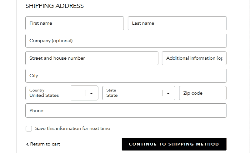
1. Registration forms
First is to spare extra forms and place registration ones only when customers have already chosen the products and added them to cart. Such operating sequence is unlikely to make people hesitate and refuse from shopping on your website because they have already spent their time on making the choice. It is better not to load down buyers with filling in personal data in advance but provide them with easy-going tour on your website. Another question is if it`s a real need to register and create an account when the purchase is minor? Make it optional for such cases.
However, we advice to follow at least one of these 2 important rules when designing registration forms:
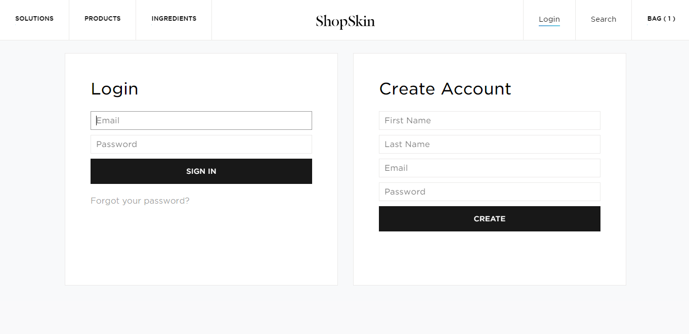
- Minimize the steps involved in registering if you want to generate maximum signups as Shopskin did:
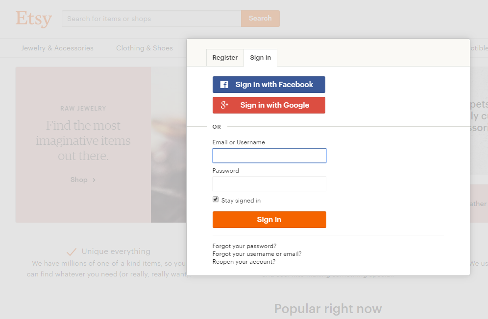
- Allow sign up/log in through a third party social media platform as Etsy provides:
These features surely lure visitors by a peculiar “promis” to make their shopping process easy, fast and not tedious.
2. Product availability
Buyers really appreciate be up to speed on product information. And the more info the better. It won`t make good to inform customer about product absence only after several data filling in steps made. It means that people just wasted their time that leads to closing your store pages and searching for another one website.
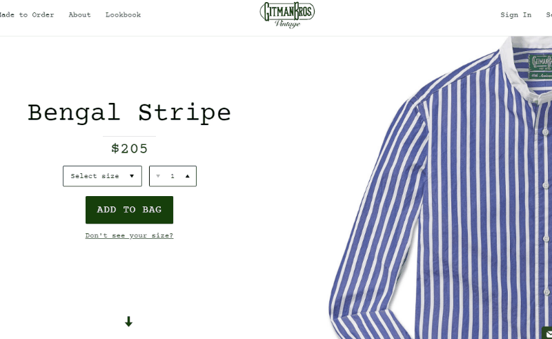
Gitman Vintage didn`t grudge the time and placed as much info about wares as possible. There you can find not only the cost, but also available sizes, detailed article description, size & fit info and shipping & return info. User-friendly, isn`t it?
3. Shopping cart operating
Designers need to take into consideration the fact that customers can be wrong about their product choice or just change their mind on the stage when the items are already in shopping cart. In this case people should be provided with the possibility to delete easily wrong items from the cart and continue checkout process without the necessity to reset filled in data and do it over. Don`t forget to add the images, description and links to each chosen item together with delivery info. Thus, customer can check everything with all the info in front of their eyes. It is a great advantage due to which your online store will be a preferred one.
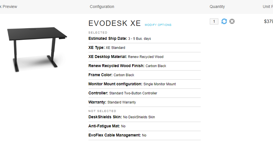
Evodesk duplicates almost all the information about product in shopping cart to avoid hesitations about buyer`s choice and recall its features.
4. Problem solving
We have already found out that sometimes mistakes in goods choosing take place. Such issues can be solved by buyer`s own. But some challenges and misconceptions appear and demand help. You always need to be available for the visitors of your site. It is extremely important to maintain them with help immediately if you want to increase a conversion rate. The best way is to provide an online support. To get it people need to fill in special form with their name and phone number after which consultant gets in touch with customer and helps to solve the problem. This way is the best one because far from everybody read Frequently Asked Question document and waste time on searching for the answers, are they? I would surely not do this and search for another one website even being already on the checkout process. And you? It should be better to prevent such situations.
Every Second Counts as many other websites chose another one way of dealing with possible problems – they invite buyers to chat online and resolve their issues:
5. Clear conclusion
The last stage shows your attitude to clients, so they should be expressed appreciation to. After the procedure is finished, people need to know what to expect and what to do next. Thus, they receive Thank You message that expresses how much valued each customer is. But to be thankful is not enough for this step – people need to be sure that everything was done right. For that purpose, they receive the email with affirmation that includes ordered goods and its` information as well as timelines. Eliminate your customers` hesitations and provide them with the alternative to correct the order as fast and easy as all the previous steps must be.
Paul Valentine is a great example of how clear and friendly checkout process must be finished.

The UX tips are important to follow if you strive to succeed. Website design makes people understand at a glance whether to stay on it and continue searching for goods, or to look through other websites.
Your aim is to earn confidence on the part of visitors and provide simple navigation due to which visitors will surely turn into customers. Proper colors, content and carefully designed User Experience eliminate competitors and lure potential customers which help to make your business flourish.
So, have you already followed these tips?