How to select color scheme for mobile application
The websites and mobile applications that provide professionally correct combination of UI (user interface) and UX (user experience) are always beyond competition. These are the key to gain confidence of customers and consequently get brand recognition and increase conversion rate.
To make application really user friendly is an important issue that impacts Internet products within market competition. Those who did their best for delivering great personal emotions and attitudes about using a particular product know that. Their clients have already made an evident choice.
But great implemented UX still doesn`t mean you outvie. As we already mentioned, you need to consider color interaction as well. In best cases such interaction does really help to perceive the content without misconstructions.
So today this is going to be the core of the article.
You want to develop your mobile application, aren`t you? Or you are already in process on the stage of colors matching? Doubts rule?
The solution is below.
Deciding on preferable colors it is important to understand the conception and the aim of the application. When it comes to health app it would be wrong to use some heavy colors as, for example, red one as being associated with fire, violence and warfare.
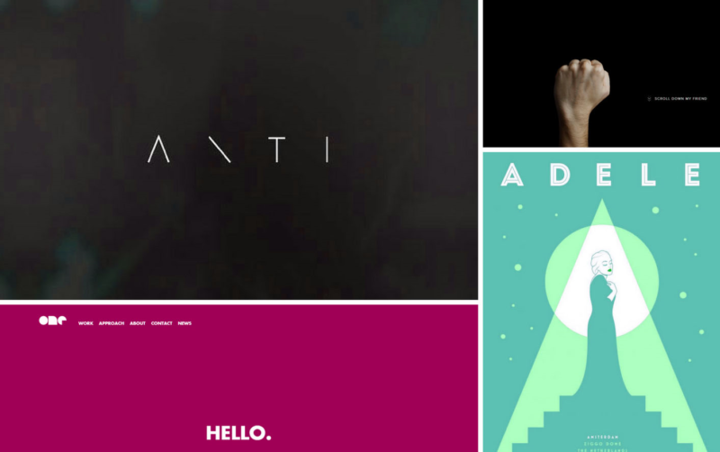
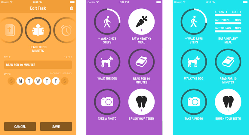
Experienced designers often use up-to-date trends to make the application modern and stylish. For instance, recently they often use pastel colors and explain their choice by easy achieving harmonious visual balance. Muted colors are less saturated than primary ones, they are light, soft and provide calming effect. By the way, this would be one of the right ways of designing healthcare applications.
You can also always refer to a color theory which reflects the meaning of each color. It is based on cultural perceptions as well as on popular brands` statistics. Thus,
- Yellow color means hope, optimism and energy. What is more, its brightness is extremely eye-catching.
- Orange is a combination of red and yellow colors mixing vitality and excitement. It reflects vitality, fun and youthfulness.
- Red is an aggressive and at the same time passionate color that provides the feeling of power and energy.
- Purple color is considered to be the color of royalty, elegancy and mystery.
- Pink is a feminine color that is associated with beauty and tenderness.
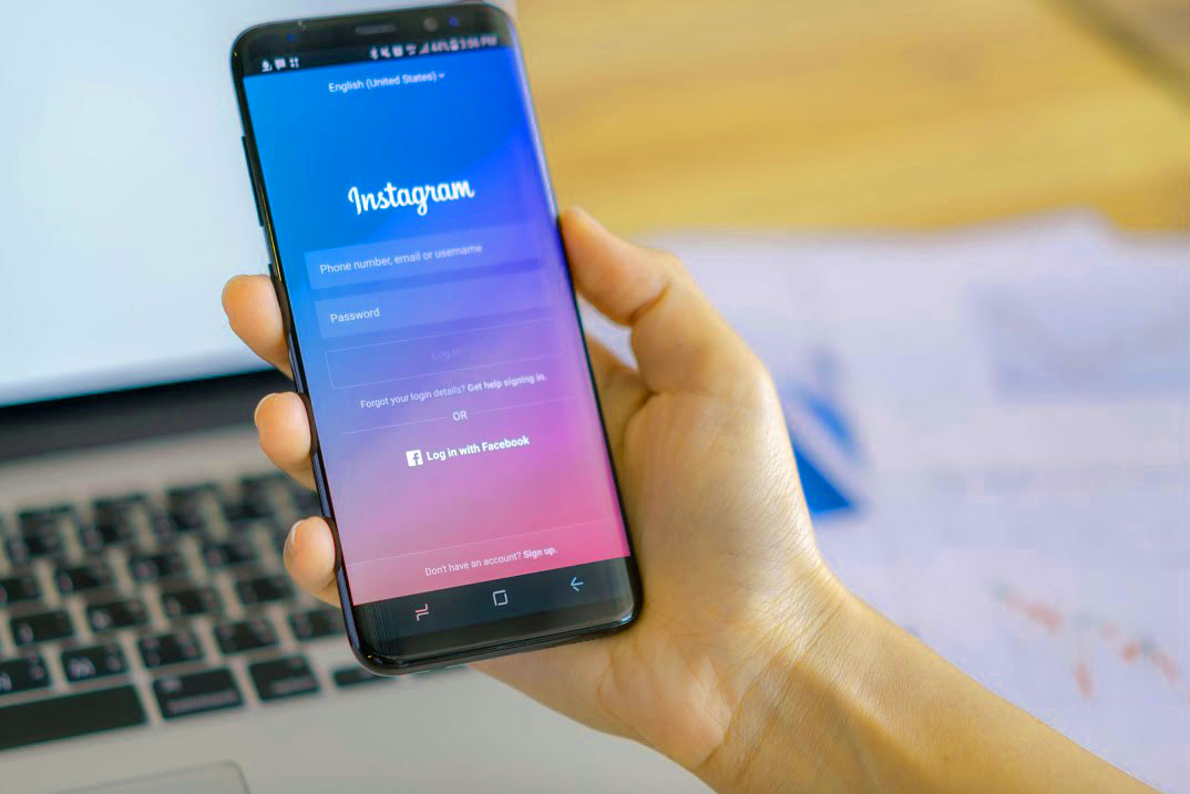
- Blue relates to the sky and the ocean. It evokes the feelings of security and calmness.
- Green is the color of health, wealth and naturality.
- Brown is a rustic color, simple but strong. Nevertheless, it is associated with dirt within brand identity.
- Black is a simple and classic color that reflects prestige, luxury and sophistication.
- White is a pure, fresh and clean color that is often used in medical, bridal and laundry industries.
- Gold color meaning is similar to black one symbolizing prestige, affluence and luxury.
- Grey/ Silver is often used to reflect simplicity and innovation. Generally, it is a choice of scientific industry and jewelry one.
According to Statista, 95% of world`s top 100 brands use blue and red colors and only 13% use yellow one. The example of Facebook, Twitter, LinkedIn, Google, Safari logos reflect these data.
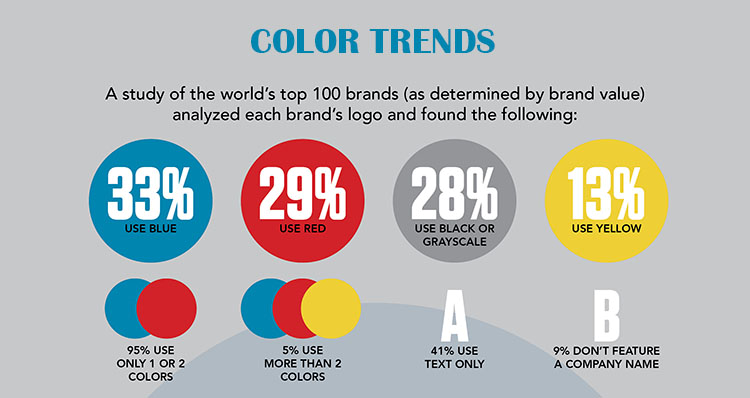
It doesn`t mean that only this way designed applications can succeed. Apple Store and Google Play Store prove designers` power of individual and creative approach to building the most diverse colorful applications and logos no matter what shows Statista.
Color is the second most essential aspect of the app after functionality because the interface look creates the first impression due to which the user decides whether to use it or not. Appropriate UI graphical elements and simple combination of colors provide fast and easy app navigation. That is why most designers have always preferred light and calm colors in order not to complicate the visual perception of the application appearance.
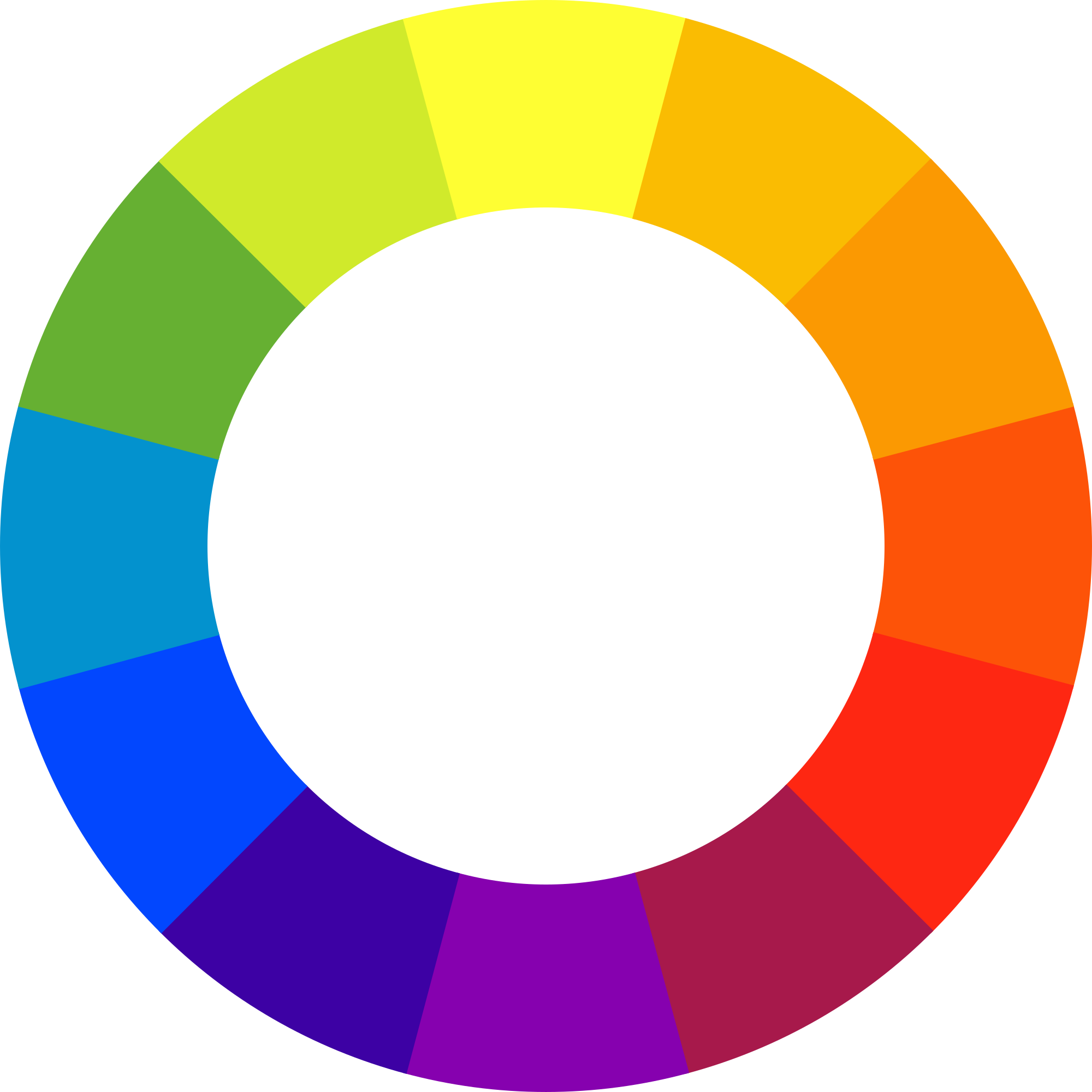
The difficulty lies in the fact that desired or necessary colors combination works odd sometimes, but you still need to keep up with fashion craze alongside with UX corroborating. There are 2 ways to solve the problem – use traditional color patterns (monochromatic, analogous, complementary, triadic) and custom patterns. The last ones mean that designers can create their own personal pattern and achieve a certain effect with the help of special applications and tools, so this is the exclusive province of a seasoned professional. Traditional schemes provide special combinations of colors that evoke aesthetic feeling accompanying each other.
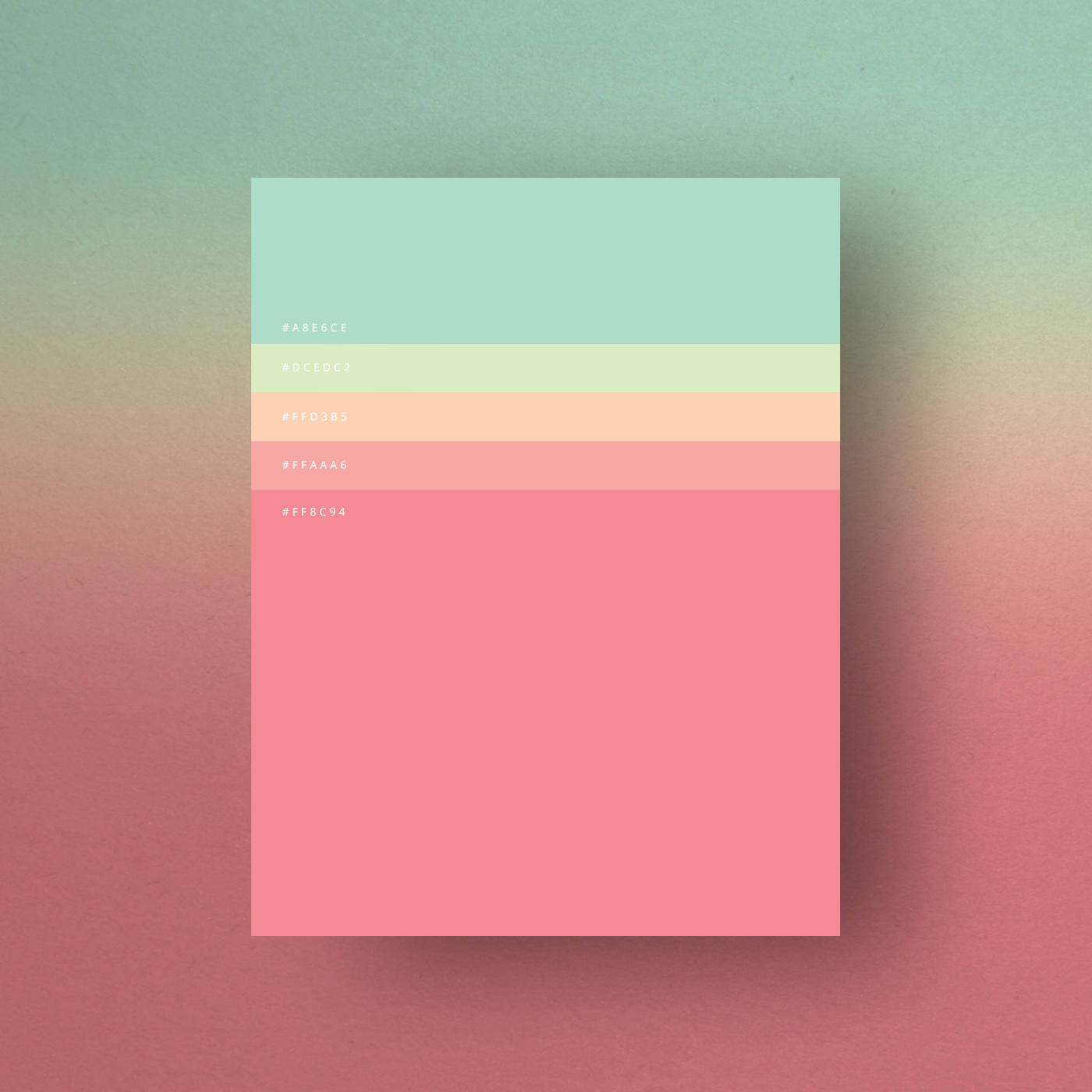
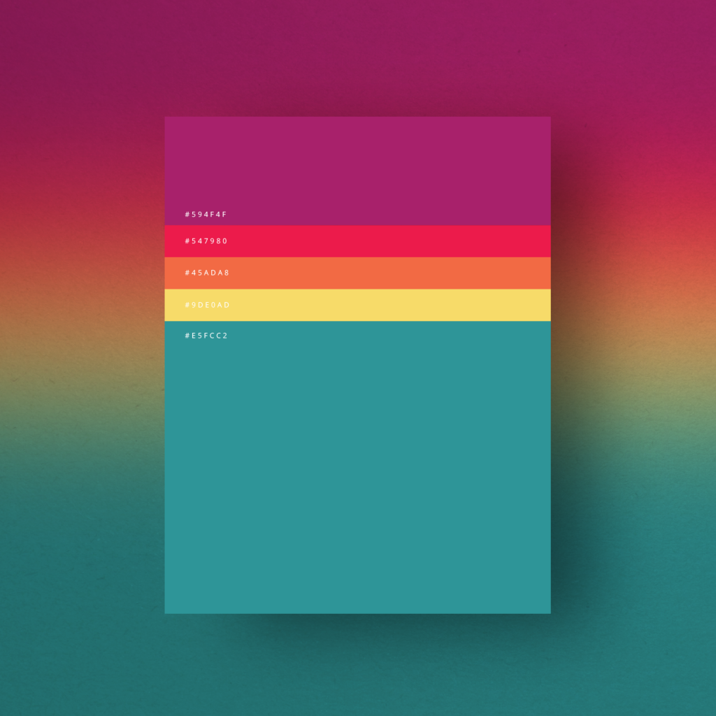
Color wheel is a permanent tool from which the process of creation commences.
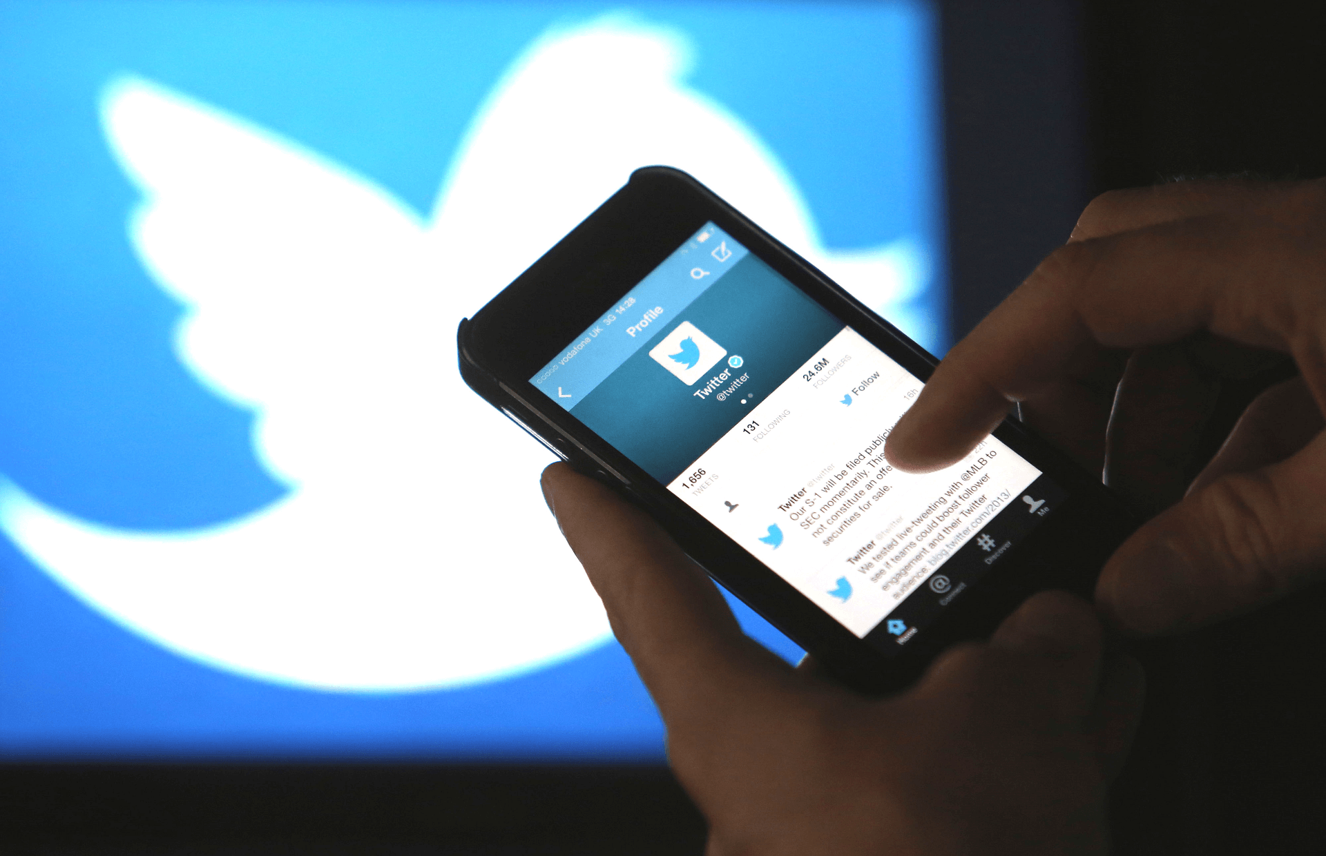
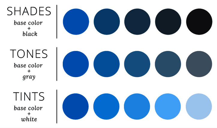
Monochromatic palette is considered to be the simplest palette in color theory. The main idea of the palette is not about the usage of only one single basic color within all the application. Designers instead chose the color and create palette by the number of its shades, tones and tints. This is sure-fire way that excludes the possibility to lose. Thus, designer saves time, passes by risks, makes app look harmonious. What is more, the brand associated with a special one color becomes recognizable faster as Twitter, Linkedin, Facebook and other popular applications did.
Analogous color scheme represents another one easy-to-use algorithm for matching colors. The idea is to choose mother color and then 2-3 color standing right after main one. No matter what side you start from, they must border each other. Thus, the look of application will surely lure by its totally balanced appearance.
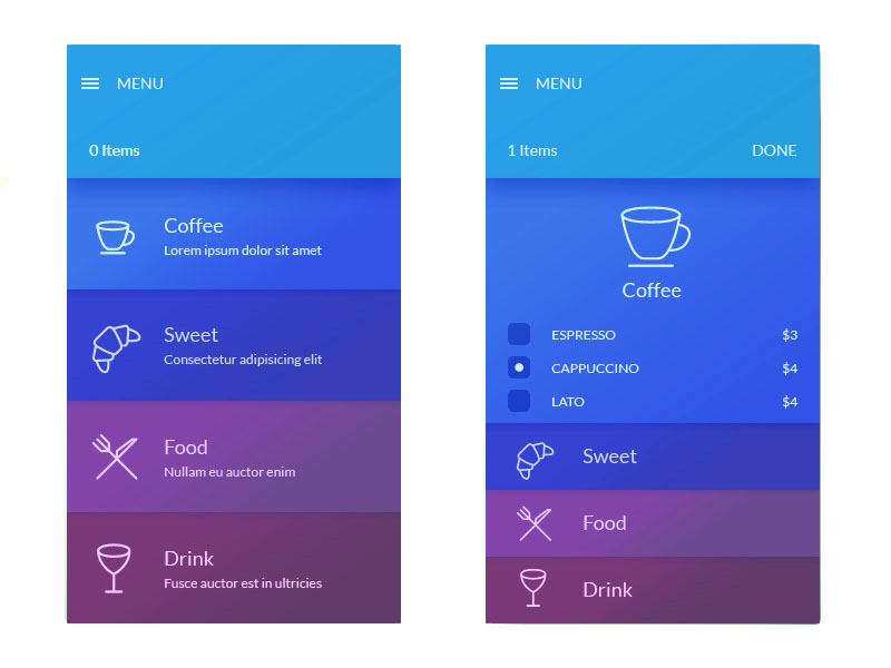
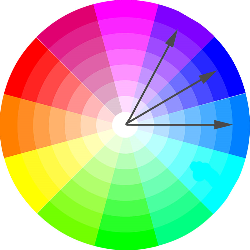
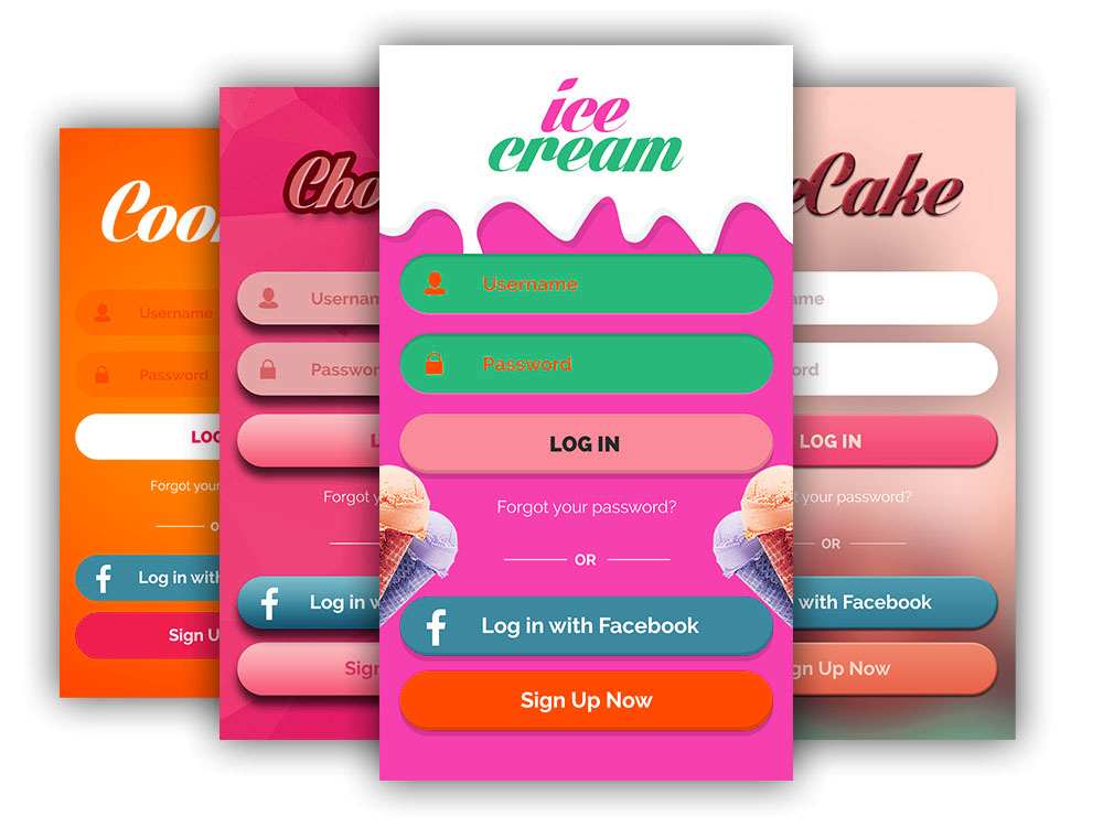
Complementary colors take place on the opposite sides of the color wheel as orange and blue creating strict contrast. Thus designers try to reach the effect due to which certain parts of mobile application stand out against a background. Thus, the look of the app becomes as bright as possible.
Usually, such an outstanding design is supplemented by as well bright icons. Vivid iconographical elements make app look as an open book separating information blocks and providing easy travelling through the app pages. In fact, modern trends dictate outstanding features so high-contrast colors are welcome. The main is not to overdo.
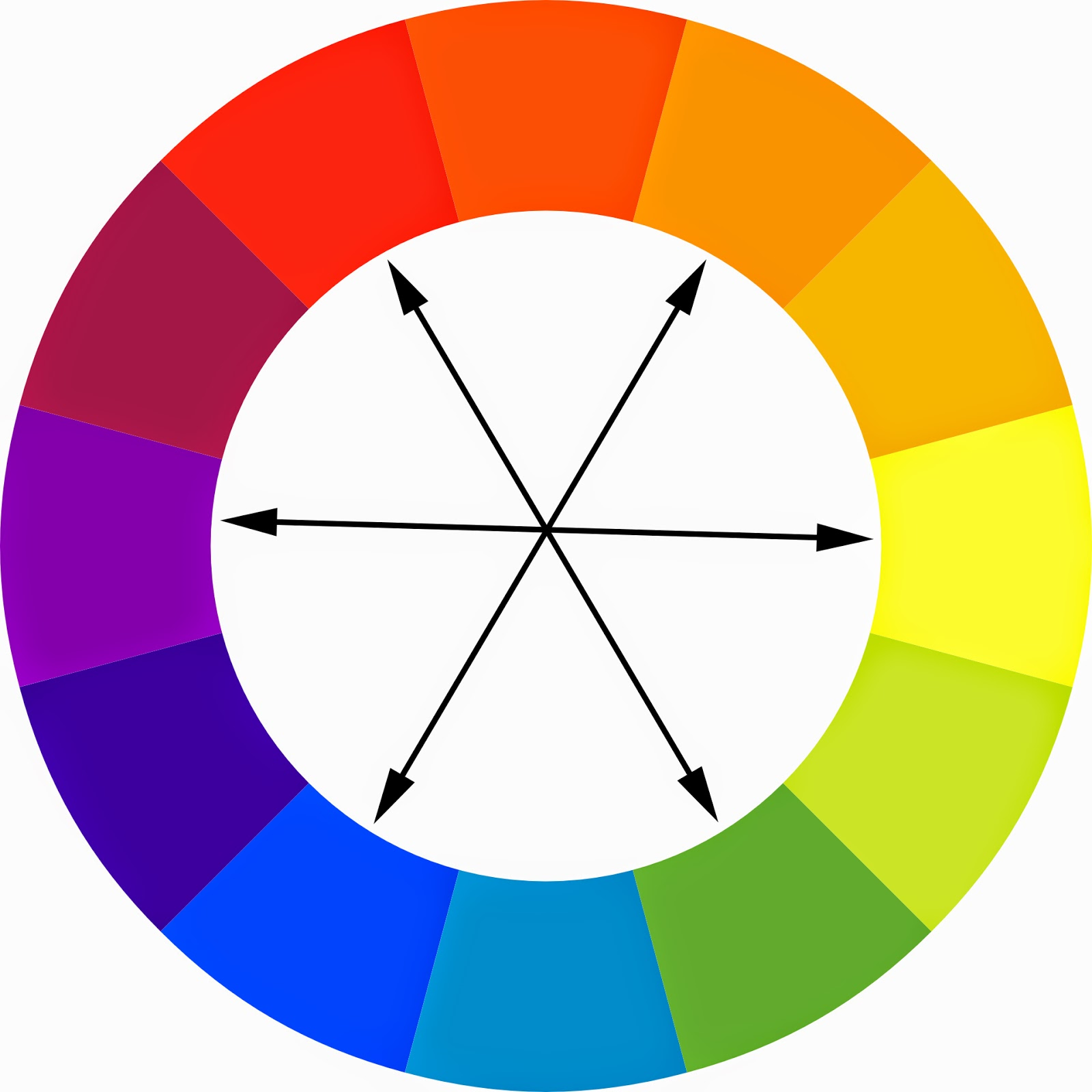
Triadic color scheme is like analogous one. The difference is that those 3 colors are equally-spaced from each other. Such combination creates contrast in some other way but still looks fresh, lively and balanced. As far as there are 12 colors on the wheel designers have only 4 possible combinations.
Designers also need to use other ways of making the application appearance beautiful and unique. Thus, they create color shades and subtle shadows adding black and white muted shadows to the mother color. Font style can also be transformed to emphasize those pieces of information that users need to notice from the first seconds of the app usage. Thus, you save their time and nervous. So, that all plays in your favor.
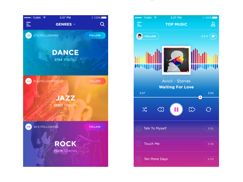
Color gradients has gained rich popularity among designers as well as pastel colors mentioned below. Such effect is widely known as a smooth continuous tone where neighbor colors on the wheel are used. But nowadays designers follow the trend to combine contrast colors for the effect – from red to blue and from yellow to purple. The most rigid rule here is not to overload the application visually.
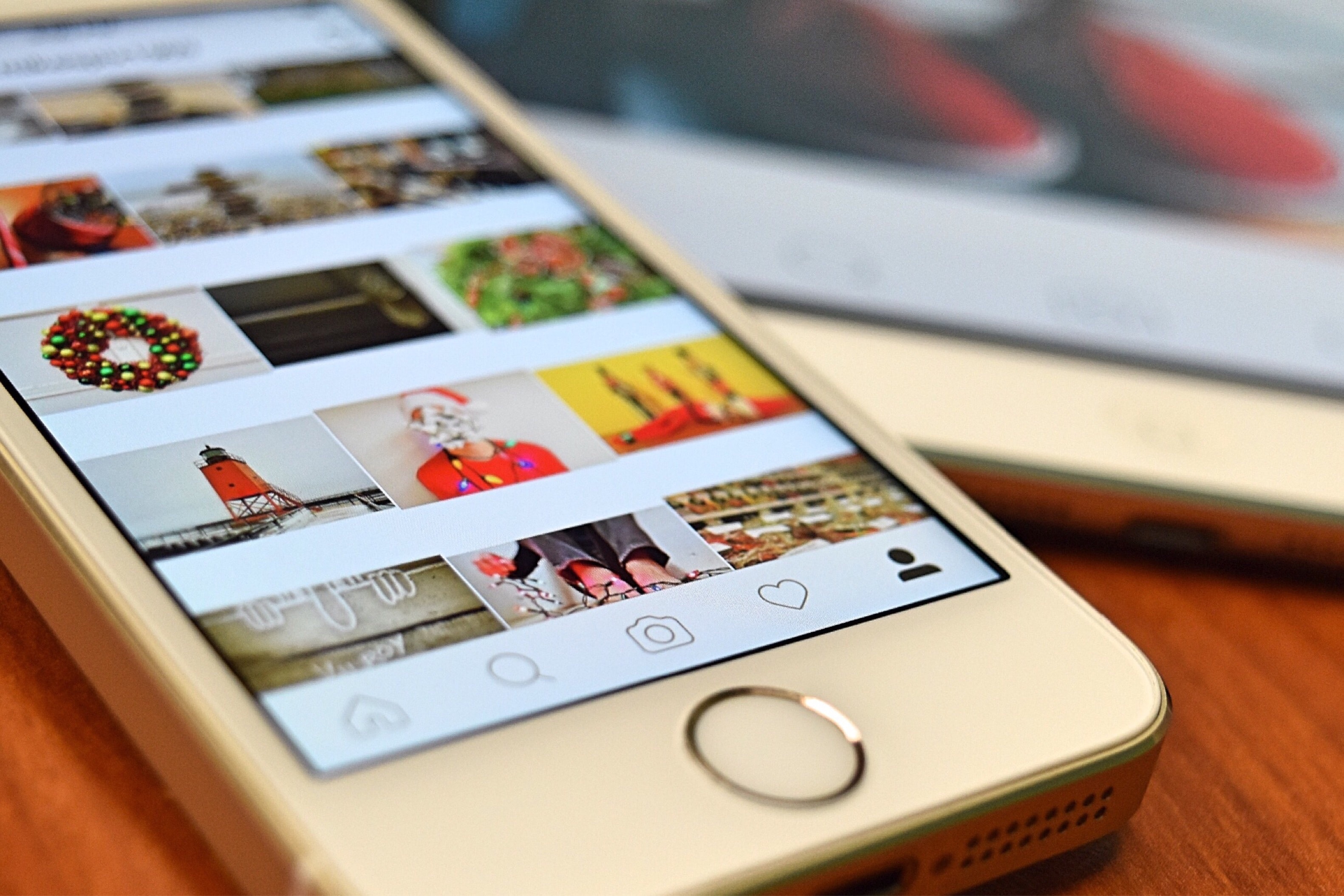
Illustrations, images and photos are also permanent attributes that enrich the application. Such additions make the applications not so strict and empty especially if you prefer minimalistic style. Moreover, some fun elements make users navigate easier and faster.
Statistics show that minimalism in design wins today. Such clear and consistent choice create best visual communication – users appreciate the absence of irrelevant elements and content that does not meet their tasks.
So, picking a color palette for design projects as well as choosing the right decision for iconography is not already a pain. A great number of tools has already done a half of your deal.
Much more simple than it seems, isn`t it?