How to Develop On-Demand Food Delivery Application

Today our modern lifestyle is characterized by striving to the highest productivity, effectiveness and fast tempos. We are always in a hurry as if constantly being under pressure. Thus, our lives are teeming with rapid emails, shortest time spans, most favorable and lucrative opportunities, fast food and so on. In other words, we tend to save as much of our energy resources as possible.

The solution for such a peculiar issue already exists – on-demand services applications do really help people to manage their day in the most appropriate way.

It’s more than likely that you have already used some on-demand service application as, for example, Uber’s taxi, e-commerce, health and beauty services, housekeeping, food and parcel delivery or any other app, and understand the great thing how it truly simplifies our life.

So, today applications have a great influence on the personal and professional lives of people. Almost all the industries have their mobility solutions – the App Store and Play Market are awash with the apps for everything.

There is no any necessity to prove that Uber is one of the most successful enterprises and a lot of young companies strive to replicate their success – in 2017 Uber customer number reached 40 million per month and by May of this year Uber’s share of the United States ride-hailing market was 77%. While there is no fitting rival for Uber on the market yet, on the contrary, the popularity of on-demand food delivery services area continues growing at an unbelievable pace, which leads to the growing demand for food delivery applications and, consequently, to the competition between them. DoorDash, GrubHub, UberEats, Deliveroo, Postmates have already carved out their niche and hit the big time now.

For example, GrubHub is a leading online food ordering company that was launched in 2004, and it still remains the best food ordering platform with a broad selection of over 70.000 restaurants, vast client database and a market capitalization of more than $2bn. GrubHub allows users to choose local restaurants and to pick order food depending on cuisine and clients` reviews. The app provides an automatic search of surrounding restaurants, saved order history service, simple navigation, real-time delivery information and many other useful features that helped to win authority among competitors. So, it is no wonder that GrubHub keeps track of 2,40,000 orders daily and has more than 6.70M users.

Technavio says that the global online on-demand food delivery services market will be up by 32 percent by 2021. Being the most demanding users of on-demand services, millennials continue popularization of the industry making it more than just a buzz. What is more, seniors also make their contribution in this process – they adopt smartphones more and more as they find mobile apps the best solution to simplify any process. The “one-touch-and-you’re-in” accessibility of today`s applications is a great tool for those with aging hands and eyes.

Thus, food delivery startups increasingly gain the attention of potential users and strive to conquer the overcrowded market.

It is real to become one of those leaders we have mentioned before – at least you need to observe all the necessary rules, principals and features which popular platforms already have. The key to success is to combine them with your unique approach that will surely lure your users.

Most food delivery startups follow the marketplace business model according to which platforms provide the connection between local restaurants with users who want to order food. Classic food ordering platform has 4 main members:

  1. Customer that uses your application/website to search for an appropriate restaurant and its menu items, choose products and add them to cart, place an order and pay for it (online/ after delivery)
  2. Restaurant that receives that order, prepares the meal for delivering it to the customer. They get paid for each order from the aggregator.
  3. Delivery agent (independent or hired by the restaurant) receives the order through a special application, takes the parcel from the restaurant and deliver it to the customer.

Platform owner that performs a balanced system of all the members’ cooperation. The “owner” gets the commission for each order from the restaurant, charges from customers, subscriptions and different sponsored ads.
 

Once you decide to set your hand to the development process of a food delivery app, there are 3 main issues you need to pay attention a lot:

  1. Customer side app
  2. Owner/ restaurant dashboard
  3. Admin dashboard or a control panel

Let’s get deep in details.

Customer-Side App

The first thing people draw attention to is a beautiful interface that allures them with its appearance and simple navigation. Users appreciate well-structured applications and websites where every needed button is seen at a glance.

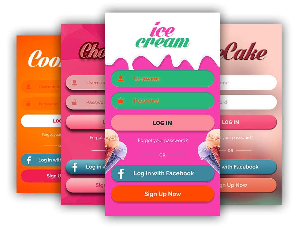
This applies to the sign-in page as well. Customers can start using your services after entering some personal info as name, email id, password, phone number and other details. All that helps you to stay in constant communication with users – you may track the story of their “traveling” on the platform, see preferable and most common requests, and then make them special personal offers.

The fewer steps a user meets on the road to making an order, the better. Let them enter personal account only through username and password – we have already mentioned that we always strive to save our time and diminish efforts while implementing some processes.

You can also add some specific questions about their favorite dishes, cuisine and restaurants in the form, which will then make their searching for meals faster.

Menu card of each restaurant needs to contain a categorized list of food with names, detailed description, images and prices. Here the principle “the more – the better” works as well – the main is not to overload with the information.

Simplify the process of searching by adding more detailed categories as cuisine (Japanese or Asian cuisine) and the type of meal. Reviews and ratings on customer dashboard can also help people with making a decision in case they don’t know exactly what they want to eat, and, in general, if the chosen restaurant really worthy.

Another one extra feature that is really appreciated is providing customers with the possibility to compose the dish almost by themselves. For example, if a user wants to order pizza, let him decide what ingredients to add and which of them to remove just by tapping on a plus or minus – if he likes cheese, let him order double cheese for extra money. The best way for that is to make it in the form of a submenu.

A great idea would be to add special timing menus as, for example, a menu for breakfast, lunch and dinner. Don’t forget about the vegetarian list and special dishes list for those who keep dietetic nutrition.

Once a customer decided on what to order, the checkout process takes place. Users need to see the list of meals they chose and all the necessary additional info before making payment. The important here is to provide the possibility to change the order on the same very stage without the necessity to go back to previous pages and redo all the process – just delete the dish or triplicate that double cheese with one sweep. Here you can also add some info about actual discounts and, what is more, lure by special discount coupons which will surely make users chose you next time. When the bill is generated it would be convenient to know the time of delivery and to track the order’s traveling in online mode. The usage of the GPS technology became an extremely popular tool due to which people hesitate less when choosing a restaurant.

Remember that people must be provided with as many ways of payment as possible – give them a free hand. Those options may include PayPal, credit and debit card, net banking, Apple and Google Wallet, and of course Cash on Delivery option.

It is important to understand that being in constant contact with the client increases your chances to become number one restaurant to choose. That is why online chats and email support is so vital – they will never leave the buying process if you are online and provide help at the right time.

Restaurant Owner Dashboard

Next step is to think over an appropriate development of the owner dashboard.
Let’s start from the login procedure. Usually, the owner logins with his personal account where he can see the list of past and latest orders and manage them as well.
We have already mentioned that the structure of a menu list of the restaurant must be well organized. The same concerns the restaurant owner dashboard. All the information, images and descriptions are necessary to fit food items, they must be relevant and actual. The catalogue is to have the possibility to be updated with the latest changes in cuisine, appropriate dishes and so on.

It is important to screen the orders and check all the accompanying information about the ordered food after which delivery agent gets order details and delivery address. Customer should also be apprised about delivery time.
What is more, the dashboard must include the part where you can keep a structured record about all the additional expenses as payment for delivery service, different refunds and so on.

Your food delivery app will surely succeed if it gathers the restaurants that are successful by themselves as separate units. To being be up to the mark and even better the owner must check all the reviews and ratings of cuisines, separate dishes, delivery service and so on regularly.

Another one useful and highly necessary service of any on-demand applications is push notification – it plays a great role in providing customers with ‘immediate satisfaction’. Those pops up on the smartphones with time delivery, chose the method of payment and other details of the order make people feel calmly and confident. These brief, powerful messages can also be sent in case menu list is updated or restaurant provides some special offers and discounts.

Admin Control Panel

Control Panel is represented as a platform from where the admin performs the control over all the operations of the online food delivery service. Admin can also decide on which restaurant to set a partnership with, and which can be added to those ones already existed on the platform or removed (and even blocked) in case restaurant has bad customer reviews. Such decisions can be made about delivery agents as well. Admin must also have an additional dashboard for controlling payments receiving from orders and additional sources.

App UX and UI

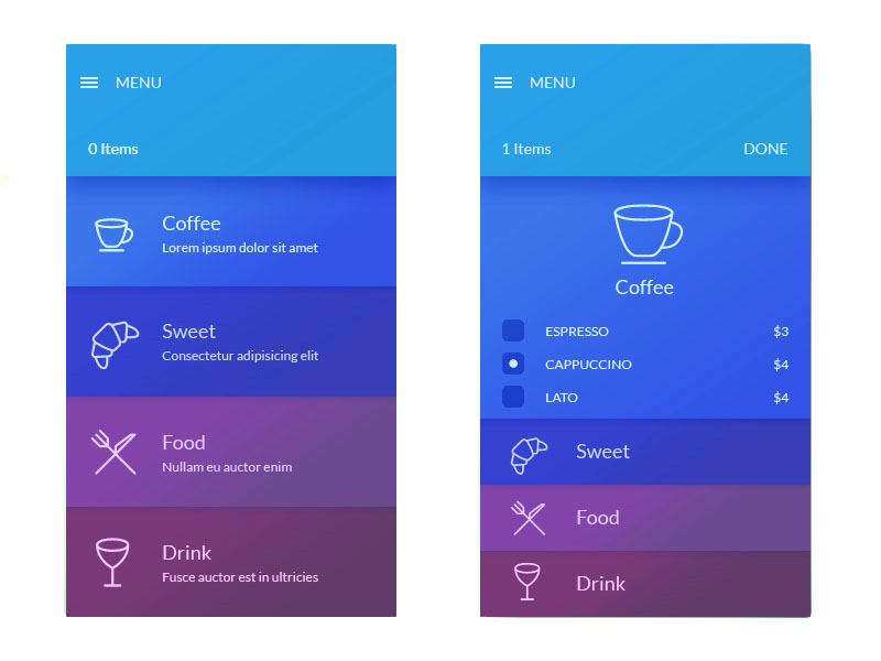
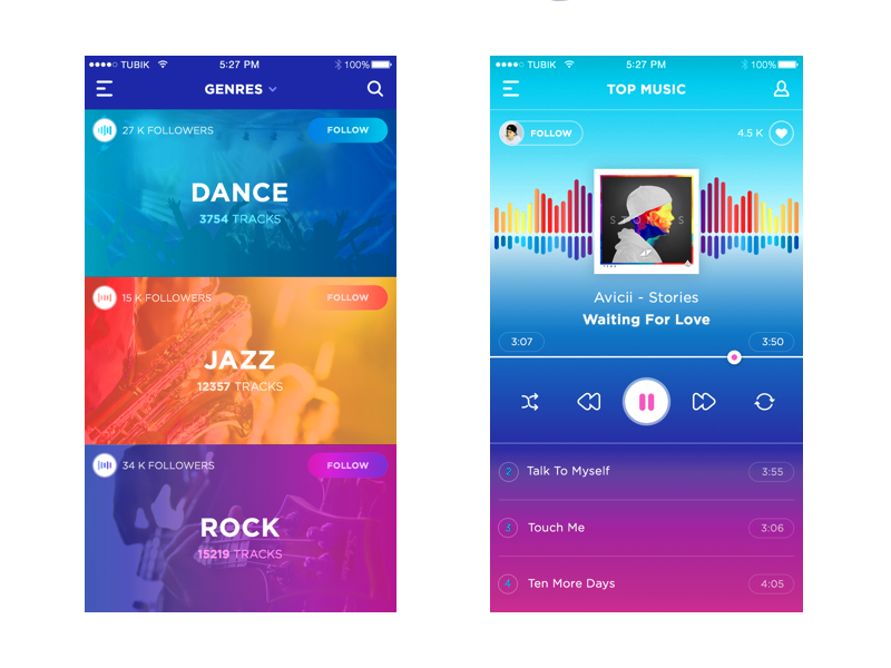
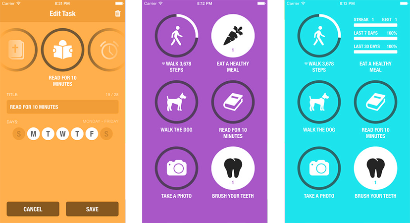
The User Interface and User Experience are one of the most important aspects of the on-demand food delivery app because it is the first what people notice when commencing the usage of your app. Users appreciate not overloaded interfaces with beautiful images which is extremely important especially for food app. Thus, you can even easier lure clients than the apps from other industries – people tend to fall for beautiful images of food, and this visual hunger provokes changes in the organism so that the desire of meal increases the traffic generation to your app. Sounds funny but it `s a proved practice.

Nevertheless, the beautiful interface works only coupled with well-structured content.

Introducing the Blockchain

Today, blockchain technology has a great impact on marketplaces providing new opportunities and changing the way of making transactions online. You probably already know that blockchain is represented as a decentralized ledger that records, verifies, and tracks cryptocurrency transactions and contracts between parties.
Blockchain-based marketplaces are peer-to-peer networks that directly connect producers, consumers and sellers without any intermediaries. Generally, they operate the same way as traditional marketplaces: producers provide information about their products, sellers also offer product information and content about their goods, consumers search for these products and make purchases.

Let us look through the main points how blockchain changes the game for traditional online marketplaces:

  • A blockchain-based marketplace is hosted by its users and supported by their computing power, which means that a marketplace is always accessible. Data hosting becomes more security, privacy, and transparency. With blockchain technology marketplaces avoid hosting costs altogether and set the lowest possible prices for producers, sellers, and consumers.
  • Each seller plays his own rules – they specify their own terms, provide special offers and opportunities, share the information about their products in their most preferable way.
  • Blockchain marketplaces is characterized by lower fees to producers and sellers, that also means lower prices for consumers. By the way, each payment is transacted directly between the consumer and the producer or seller.
  • By using digital currency, producers and sellers don’t need to trust anybody with taking payments on their behalf, as payments are transacted directly between the consumer and the producer or seller.
  • As for sellers & consumers interaction, producers don’t have to pay for placing their products on the marketplace. They pay only when a product is purchased. Sellers can offer any products they wish and promote them in any way they like, getting commissions for each sale. Customers can choose the products they want at the price that’s most attractive to them.
  • Blockchain marketplaces provide transparency for transactions and agreements. Additionally, producers and sellers are offered a digital IDs to verify and track their products and businesses.

Smart contracts is another one reliable and unbreakable integrant of the blockchain-based marketplace that removes third parties and guarantees trusted transactions.
As you see, blockchain-based marketplace removes intermediaries, all transactions are traceable on a public ledger, demonstrating a high level of security and transparency. This is a really big deal if you our business manages a marketplace.

Summing up it is worth to say that the development of on-demand food application is a great chance to become one of those mobile app market giants. The key to success is to analyze that market and become better on that base.

Our team can share the unique expertise and best e-commerce marketplace solutions. If you feel it is a high time to develop your own on-demand food delivery application one, feel free to contact us.


Tips for Finding a Great Designer to Customize Your eCommerce Website

Nearly every eCommerce platform today comes with a selection of free and premium themes, allowing you to quickly apply a design to your website. You can often apply customizations to them yourself, although this isn’t always easy beyond simple things like background images and colors. Still, with a little work, many online store owners have no problems using a pre-existing theme.


However, you might decide none of the available themes are right for you. Maybe your platform only offers themes that use outdated design conventions, or maybe they all look very similar. Or maybe you’ve used a theme for a while, but you feel your brand is ready to solidify its look through a unique design. Or, perhaps, you can’t find anything you feel truly represents your brand and the image you’d like for it to project. The solution in all these cases is a custom design.


Your needs can fall closer to the technical end of the spectrum, too. You might need a specific functionality that isn’t already available in your eCommerce platform’s built-in integrations or app store. These needs can vary significantly — you might need your company’s proprietary software to work with your eCommerce website, or you could need something comparatively simple. In this case, you’ll need a developer with knowledge of how to build the features you’re seeking. In many cases, design and development need to come together to create the best results.


Whether you need a new look for your website or an expansion of its integrations and capabilities, here are some things to keep in mind as you look for a designer or developer.

Familiarity with your platform

This should be the first qualification you look for: you need someone who understands the intricacies of the eCommerce platform your website runs on. While many eCommerce platforms utilize common coding languages, others have much more specific requirements. Always ensure the developer you’re evaluating has the knowledge and experience to work with the software you use.

Quality of past work

Any experienced developer or designer has an online portfolio of completed projects. These usually include screenshots and links to websites they’ve previously worked on. Spend some time visiting the sites in the portfolio and click as many links as you can. Look for problems like broken links, error messages, and potentially-unanticipated design flaws. It’s up to you to judge the quality of the work, but any obvious issues are cause to find someone else to work with.

Ability to communicate

The best developers are interested in full communication with you to make sure they’re accurately understanding your needs and can produce what you want. They listen to your requirements, make suggestions, explain timeframes, and maintain communication throughout the process. Look for a someone who can form a solid relationship with you as you work together. If they have a project flow on their website, in which every step of the process is explained, this is a good sign.

Understandable pricing

Most design and development is priced by quote, which is arrived at through discussion of the work you need to be done. If you have a hard time understanding what’s included in the price — amount of work, number of revisions, etc. — ask for clarification. If the developer seems to have trouble arriving at a specific amount of work for a specific price, this is often a sign of inexperience or sloppy business practices, and chances are, you won’t feel as if you got what you paid for. It’s important to have a budget for web design since this is an important cost to consider when building an online store.

Customer reviews and testimonials

If you’re considering working with someone for just about any project, learning from their previous customers is always helpful. Look for reviews and testimonials, not just on the developer’s own website, but elsewhere. Search for their business name on Google or another search engine and read all the customer feedback you can find. You won’t find as much information on smaller or newer companies, but you may run across valuable information that can help you decide whether or not to use them.

Conclusion

There’s a wide world of eCommerce developers and designers out there, and choosing can be difficult. It’s easier, though, when you know what to watch out for — both good signs and bad. Keep a list of individuals and firms you’re interested in and eliminate the ones who raise red flags during any point of your evaluation process. By doing this, you’ll be able to narrow the field until you find the right one to work with: someone who understands what you need and has the ability to create it to your satisfaction at a fair price.


How to select color scheme for mobile application


The websites and mobile applications that provide professionally correct combination of UI (user interface) and UX (user experience) are always beyond competition. These are the key to gain confidence of customers and consequently get brand recognition and increase conversion rate.


To make application really user friendly is an important issue that impacts Internet products within market competition. Those who did their best for delivering great personal emotions and attitudes about using a particular product know that. Their clients have already made an evident choice.


But great implemented UX still doesn`t mean you outvie. As we already mentioned, you need to consider color interaction as well. In best cases such interaction does really help to perceive the content without misconstructions.


So today this is going to be the core of the article.


You want to develop your mobile application, aren`t you? Or you are already in process on the stage of colors matching? Doubts rule?


The solution is below.


Deciding on preferable colors it is important to understand the conception and the aim of the application. When it comes to health app it would be wrong to use some heavy colors as, for example, red one as being associated with fire, violence and warfare.


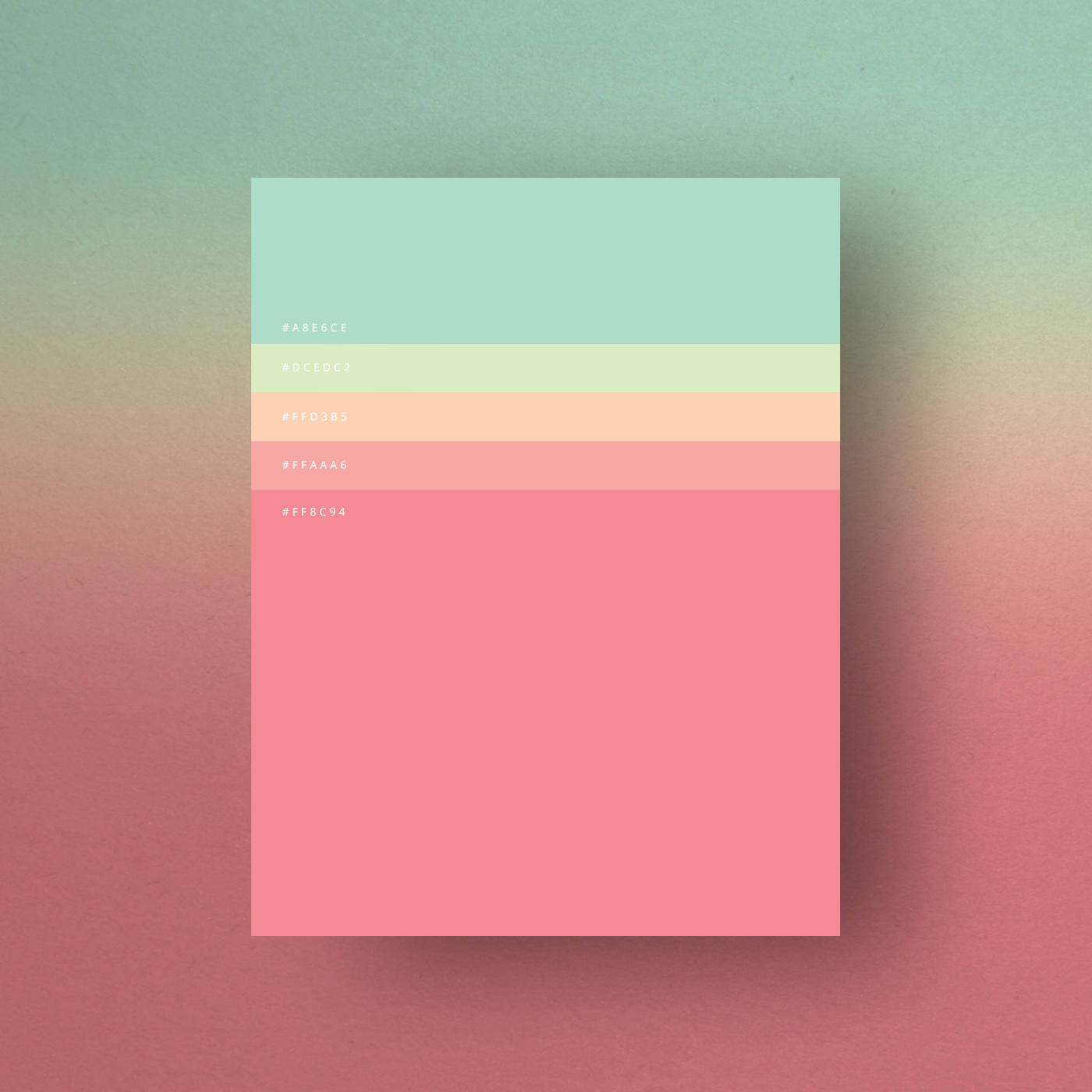
Experienced designers often use up-to-date trends to make the application modern and stylish. For instance, recently they often use pastel colors and explain their choice by easy achieving harmonious visual balance. Muted colors are less saturated than primary ones, they are light, soft and provide calming effect. By the way, this would be one of the right ways of designing healthcare applications.


You can also always refer to a color theory which reflects the meaning of each color. It is based on cultural perceptions as well as on popular brands` statistics. Thus,


  1. Yellow color means hope, optimism and energy. What is more, its brightness is extremely eye-catching.
  2. Orange is a combination of red and yellow colors mixing vitality and excitement. It reflects vitality, fun and youthfulness.
  3. Red is an aggressive and at the same time passionate color that provides the feeling of power and energy.
  4. Purple color is considered to be the color of royalty, elegancy and mystery.
  5. Pink is a feminine color that is associated with beauty and tenderness.
  6. Blue relates to the sky and the ocean. It evokes the feelings of security and calmness.
  7. Green is the color of health, wealth and naturality.
  8. Brown is a rustic color, simple but strong. Nevertheless, it is associated with dirt within brand identity.
  9. Black is a simple and classic color that reflects prestige, luxury and sophistication.
  10. White is a pure, fresh and clean color that is often used in medical, bridal and laundry industries.
  11. Gold color meaning is similar to black one symbolizing prestige, affluence and luxury.
  12. Grey/ Silver is often used to reflect simplicity and innovation. Generally, it is a choice of scientific industry and jewelry one.


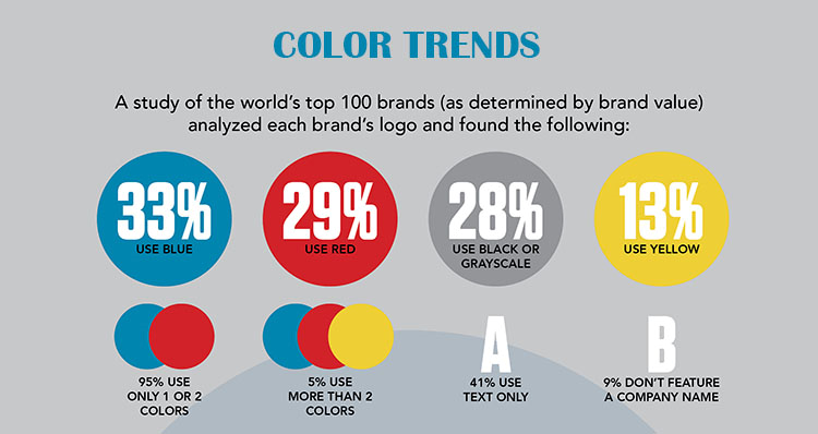
According to Statista, 95% of world`s top 100 brands use blue and red colors and only 13% use yellow one. The example of Facebook, Twitter, LinkedIn, Google, Safari logos reflect these data.


It doesn`t mean that only this way designed applications can succeed. Apple Store and Google Play Store prove designers` power of individual and creative approach to building the most diverse colorful applications and logos no matter what shows Statista.


Color is the second most essential aspect of the app after functionality because the interface look creates the first impression due to which the user decides whether to use it or not. Appropriate UI graphical elements and simple combination of colors provide fast and easy app navigation. That is why most designers have always preferred light and calm colors in order not to complicate the visual perception of the application appearance.


The difficulty lies in the fact that desired or necessary colors combination works odd sometimes, but you still need to keep up with fashion craze alongside with UX corroborating. There are 2 ways to solve the problem – use traditional color patterns (monochromatic, analogous, complementary, triadic) and custom patterns. The last ones mean that designers can create their own personal pattern and achieve a certain effect with the help of special applications and tools, so this is the exclusive province of a seasoned professional. Traditional schemes provide special combinations of colors that evoke aesthetic feeling accompanying each other.


Color wheel is a permanent tool from which the process of creation commences.


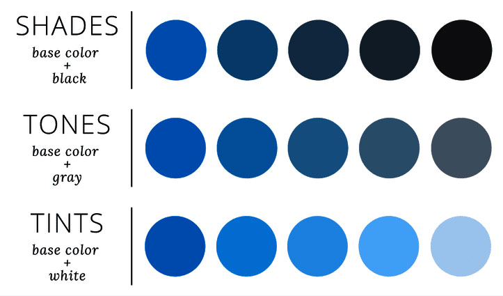
Monochromatic palette is considered to be the simplest palette in color theory. The main idea of the palette is not about the usage of only one single basic color within all the application. Designers instead chose the color and create palette by the number of its shades, tones and tints. This is sure-fire way that excludes the possibility to lose. Thus, designer saves time, passes by risks, makes app look harmonious. What is more, the brand associated with a special one color becomes recognizable faster as Twitter, Linkedin, Facebook and other popular applications did.


Analogous color scheme represents another one easy-to-use algorithm for matching colors. The idea is to choose mother color and then 2-3 color standing right after main one. No matter what side you start from, they must border each other. Thus, the look of application will surely lure by its totally balanced appearance.


Complementary colors take place on the opposite sides of the color wheel as orange and blue creating strict contrast. Thus designers try to reach the effect due to which certain parts of mobile application stand out against a background. Thus, the look of the app becomes as bright as possible.


Usually, such an outstanding design is supplemented by as well bright icons. Vivid iconographical elements make app look as an open book separating information blocks and providing easy travelling through the app pages. In fact, modern trends dictate outstanding features so high-contrast colors are welcome. The main is not to overdo.


Triadic color scheme is like analogous one. The difference is that those 3 colors are equally-spaced from each other. Such combination creates contrast in some other way but still looks fresh, lively and balanced. As far as there are 12 colors on the wheel designers have only 4 possible combinations.


Designers also need to use other ways of making the application appearance beautiful and unique. Thus, they create color shades and subtle shadows adding black and white muted shadows to the mother color. Font style can also be transformed to emphasize those pieces of information that users need to notice from the first seconds of the app usage. Thus, you save their time and nervous. So, that all plays in your favor.


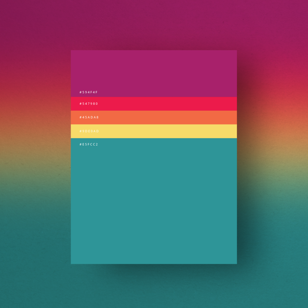
Color gradients has gained rich popularity among designers as well as pastel colors mentioned below. Such effect is widely known as a smooth continuous tone where neighbor colors on the wheel are used. But nowadays designers follow the trend to combine contrast colors for the effect – from red to blue and from yellow to purple. The most rigid rule here is not to overload the application visually.


Illustrations, images and photos are also permanent attributes that enrich the application. Such additions make the applications not so strict and empty especially if you prefer minimalistic style. Moreover, some fun elements make users navigate easier and faster.


Statistics show that minimalism in design wins today. Such clear and consistent choice create best visual communication – users appreciate the absence of irrelevant elements and content that does not meet their tasks.


So, picking a color palette for design projects as well as choosing the right decision for iconography is not already a pain. A great number of tools has already done a half of your deal.


Much more simple than it seems, isn`t it?


Top 5 tips for designing smooth checkout process

Today having a business without an existing website is much more like not having that business at all. More and more people strive to create their own websites and it is not only about up-to-date trends. Business owners are not the ones who appreciate the advantages of websites` creation – customers also get great benefits from it. Due to the easier access to computers and increased utilization of smartphones around the world the number of digital buyers is in constant grow. According to Statista, over 2.14 billion people worldwide are expected to buy goods and services online by the year 2021, while the global number of digital buyers in 2016 was 1.66 billion.

However, it is not enough just to have a site.

What exactly do people expect from your website? The look of your logo, fonts and beautiful images? That all is important but still not enough.

Best there is a combination of both look and usability of a website, and this is the concern of designers to make the website look and operate properly.

As far as people all around the world treat Internet as source of information №1, they want to find it as fast as possible. Once they click on a link – expectations should be complied. It is extremely important to provide visitors with answers quickly and without superfluous movements because, otherwise, they close your site and try another one. The ignorance of usability issues is a crucial mistake because of which business owners lose their potential customers.

In order to gain popularity and clients` appreciation professional designers simplify site navigation as much as possible. Thus, site visitors easily find what they need and become closer to making a purchase.

Correct website design is extremely important when you are aimed at success which generally lies in improving the conversion rates for products. That`s why clear and smooth checkout process is also a must.

Those numerous forms for registration, inaccurate product availability information and other unnecessary and superfluous design elements make visitors displeased. Excessive color compositions and secondary information distract buyers and slow down the process.

Thus, we decided to prepare the list of Top 5 tips for smooth checkout process for you. Check if each of these tips are considered by your designers:

1. Registration forms

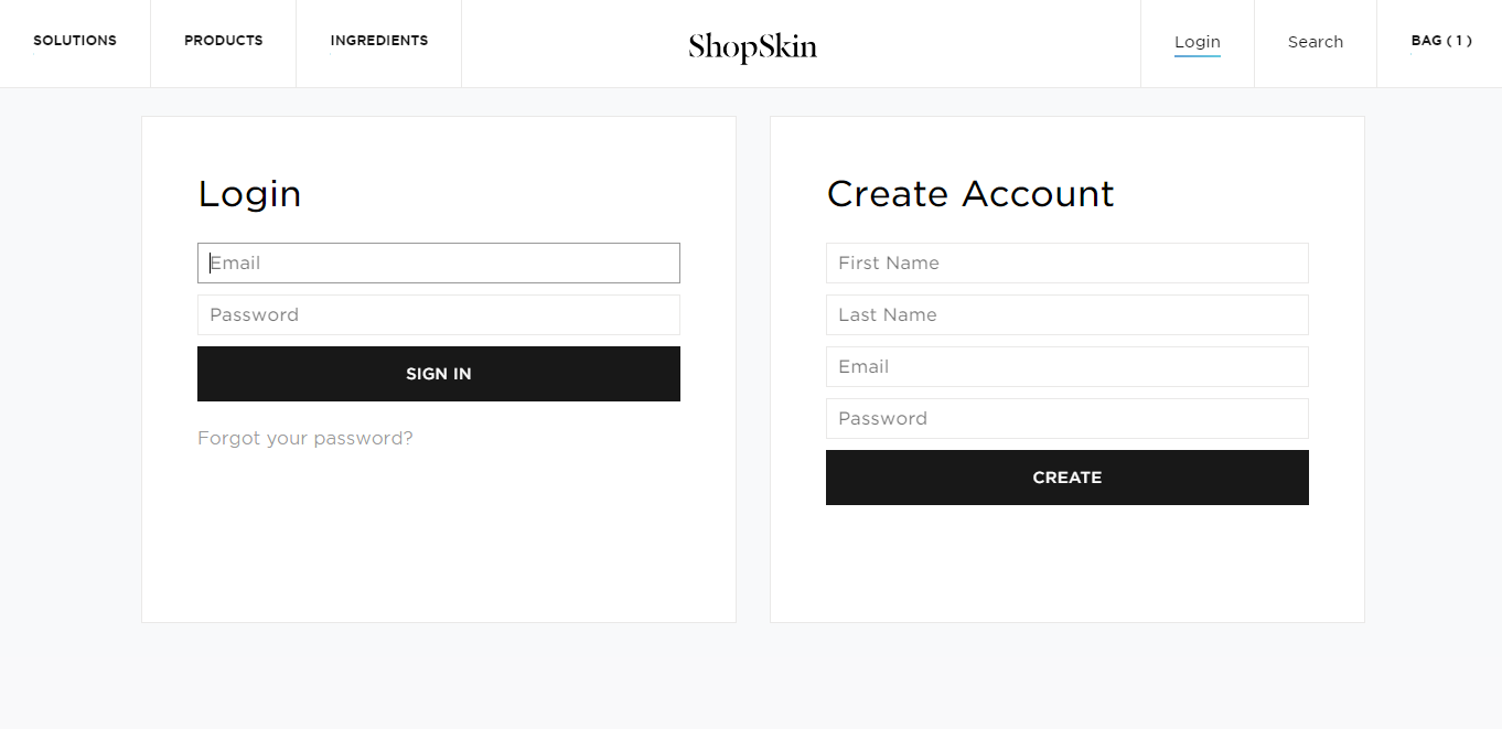
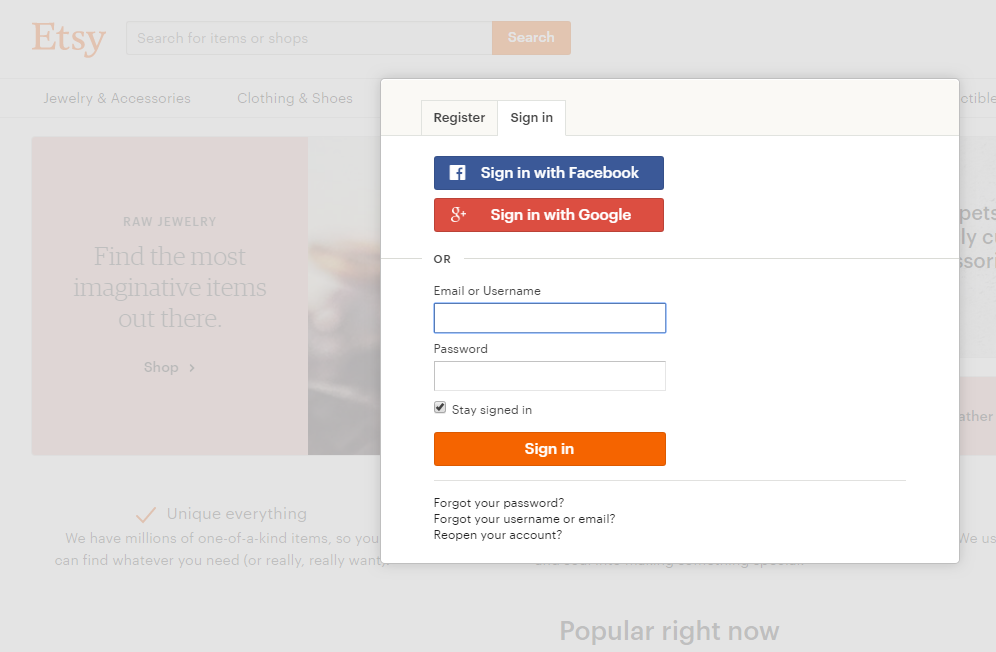
First is to spare extra forms and place registration ones only when customers have already chosen the products and added them to cart. Such operating sequence is unlikely to make people hesitate and refuse from shopping on your website because they have already spent their time on making the choice. It is better not to load down buyers with filling in personal data in advance but provide them with easy-going tour on your website. Another question is if it`s a real need to register and create an account when the purchase is minor? Make it optional for such cases.

However, we advice to follow at least one of these 2 important rules when designing registration forms:

  • Minimize the steps involved in registering if you want to generate maximum signups as Shopskin did:

  • Allow sign up/log in through a third party social media platform as Etsy provides:

These features surely lure visitors by a peculiar “promis” to make their shopping process easy, fast and not tedious.

2. Product availability

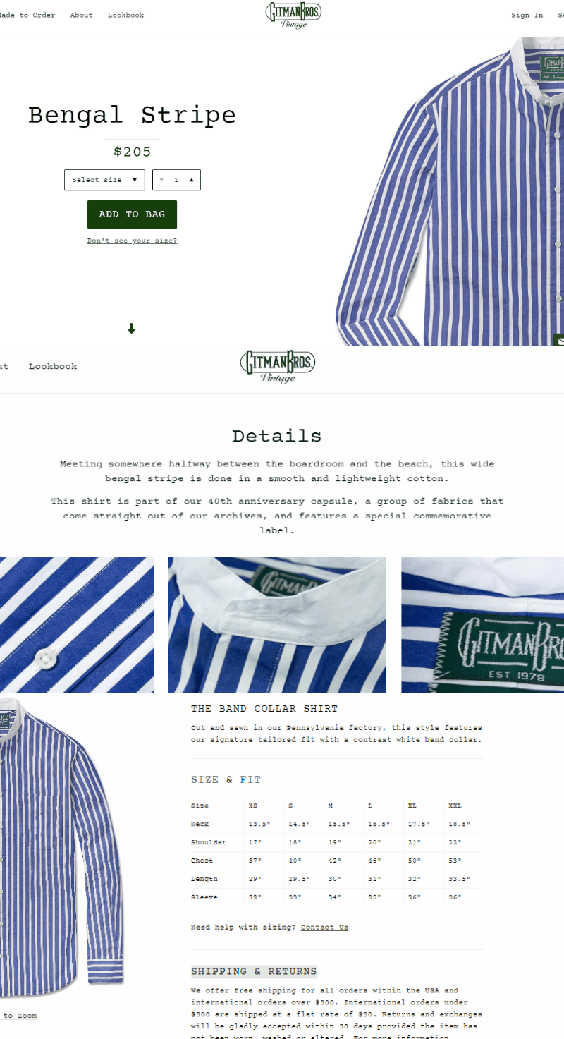
Buyers really appreciate be up to speed on product information. And the more info the better. It won`t make good to inform customer about product absence only after several data filling in steps made. It means that people just wasted their time that leads to closing your store pages and searching for another one website.

Gitman Vintage didn`t grudge the time and placed as much info about wares as possible. There you can find not only the cost, but also available sizes, detailed article description, size & fit info and shipping & return info. User-friendly, isn`t it?


3. Shopping cart operating

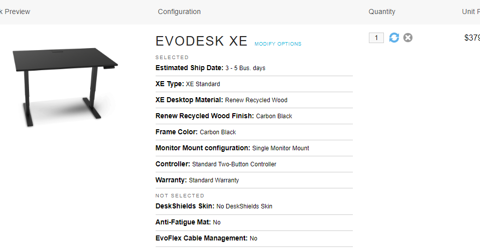
Designers need to take into consideration the fact that customers can be wrong about their product choice or just change their mind on the stage when the items are already in shopping cart. In this case people should be provided with the possibility to delete easily wrong items from the cart and continue checkout process without the necessity to reset filled in data and do it over. Don`t forget to add the images, description and links to each chosen item together with delivery info. Thus, customer can check everything with all the info in front of their eyes. It is a great advantage due to which your online store will be a preferred one.

Evodesk duplicates almost all the information about product in shopping cart to avoid hesitations about buyer`s choice and recall its features.

4. Problem solving

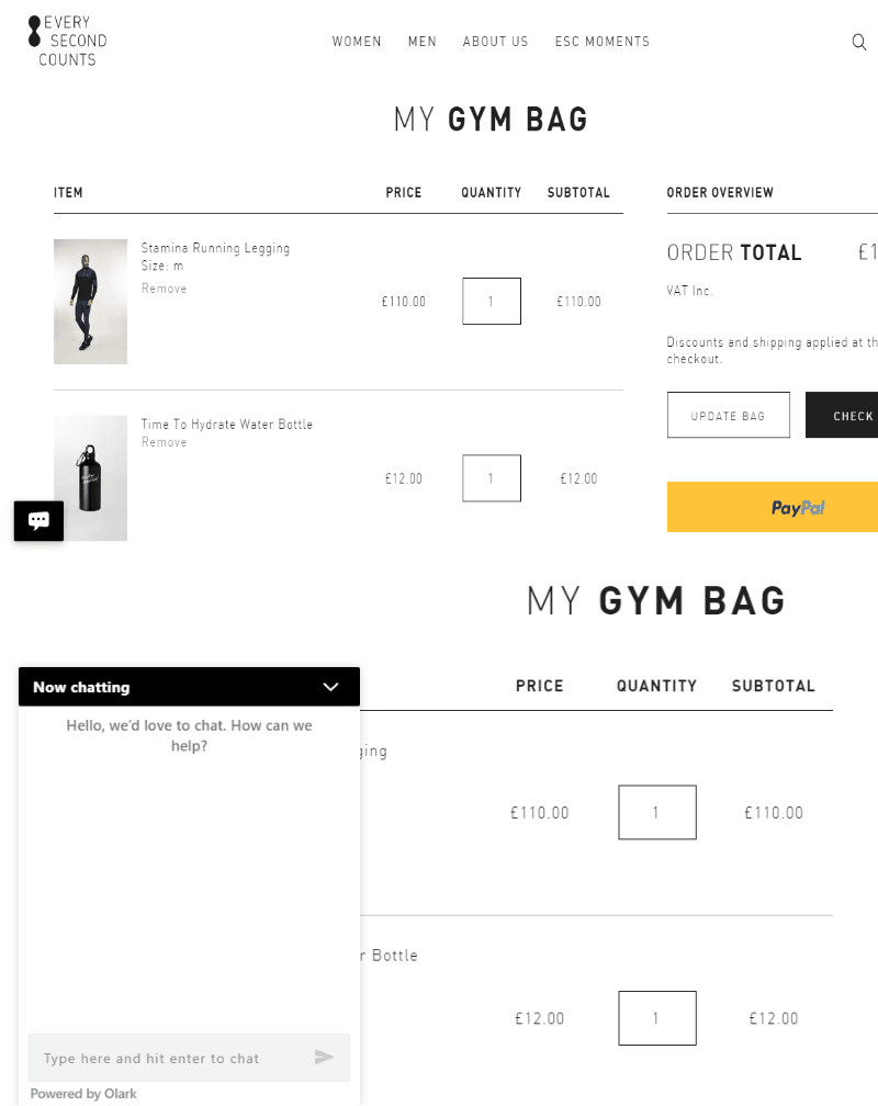
We have already found out that sometimes mistakes in goods choosing take place. Such issues can be solved by buyer`s own. But some challenges and misconceptions appear and demand help. You always need to be available for the visitors of your site. It is extremely important to maintain them with help immediately if you want to increase a conversion rate. The best way is to provide an online support. To get it people need to fill in special form with their name and phone number after which consultant gets in touch with customer and helps to solve the problem. This way is the best one because far from everybody read Frequently Asked Question document and waste time on searching for the answers, are they? I would surely not do this and search for another one website even being already on the checkout process. And you? It should be better to prevent such situations.

Every Second Counts as many other websites chose another one way of dealing with possible problems – they invite buyers to chat online and resolve their issues:

5. Clear conclusion

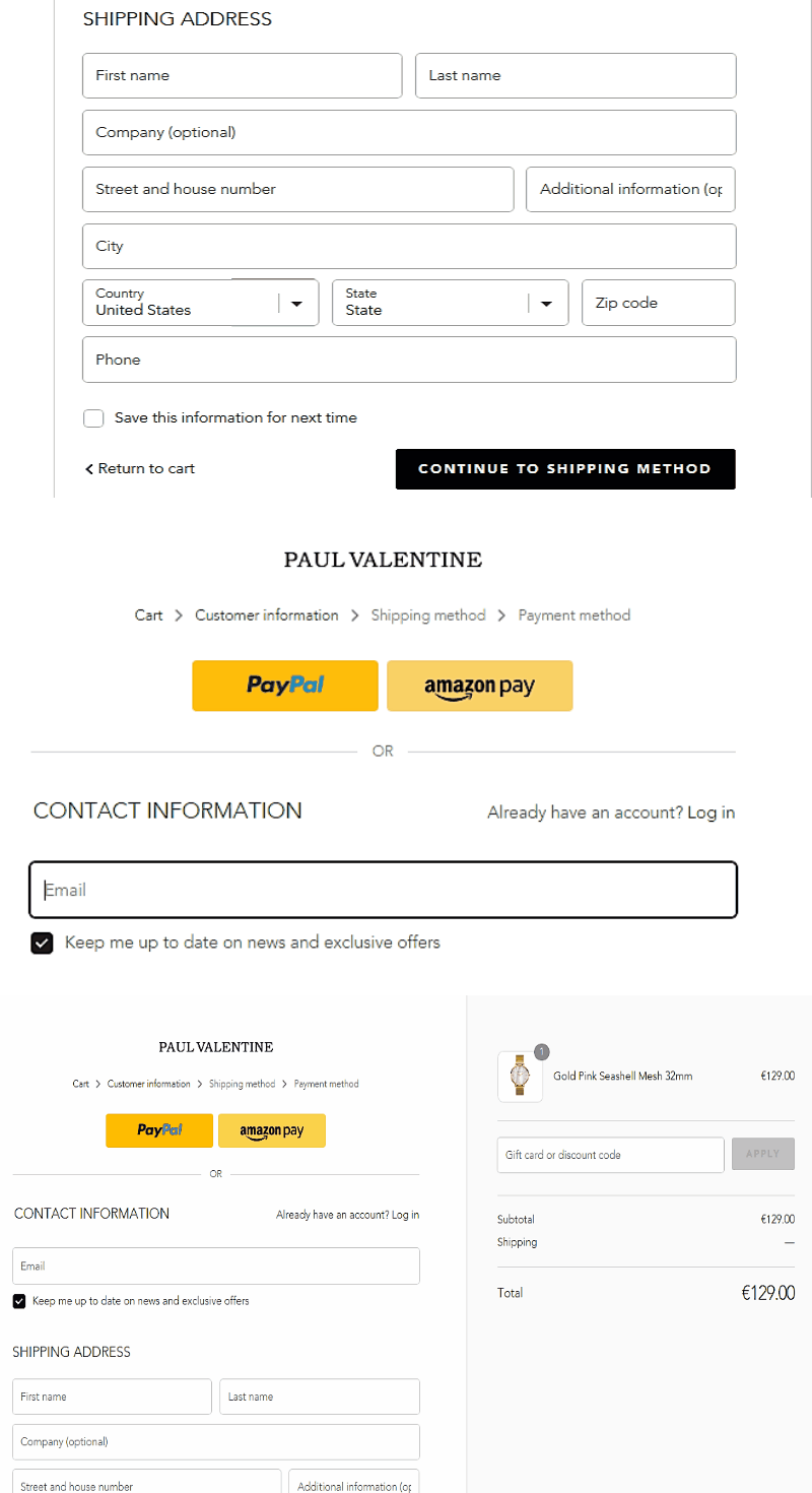
The last stage shows your attitude to clients, so they should be expressed appreciation to. After the procedure is finished, people need to know what to expect and what to do next. Thus, they receive Thank You message that expresses how much valued each customer is. But to be thankful is not enough for this step – people need to be sure that everything was done right. For that purpose, they receive the email with affirmation that includes ordered goods and its` information as well as timelines. Eliminate your customers` hesitations and provide them with the alternative to correct the order as fast and easy as all the previous steps must be.

Paul Valentine is a great example of how clear and friendly checkout process must be finished.


The UX tips are important to follow if you strive to succeed. Website design makes people understand at a glance whether to stay on it and continue searching for goods, or to look through other websites.


Your aim is to earn confidence on the part of visitors and provide simple navigation due to which visitors will surely turn into customers. Proper colors, content and carefully designed User Experience eliminate competitors and lure potential customers which help to make your business flourish.


So, have you already followed these tips?

Top 5 Multi-Vendor Marketplace Scripts of 2018


With an incredible success of Amazon and Ebay, both small and large businesses` attention is being increasingly focused on Multi-Vendor Shopping Cart Scripts. People buy it as a package that provides partially free setup. Thus vendors avoid developers` support stage. Such packages already include ready-to-use dashboard that provides the possibility to adjust the working space in most preferable way. Site-administrators and merchants work under self-sustainment so everyone minds their own business and doesn’t influence each other`s working process.

Read more

Top AR startups 2018


Augmented reality has been experiencing constant growth during throughout last few years. Together with VR, Augmented reality revenue is projected to increase to more than £130 billion in 2020. So there is no doubt that such marketing strategy is the future of e-commerce and otherwise.

We prepared top 8 most interesting and useful augmented reality startups to keep your eye on in 2018. Read more

ARKit vs ARCore


Today almost everyone heard about virtual reality (VR)and augmented reality (AR). While these words remind many people of entertainments and video games, the terms start to gain popularity in the spheres of business, marketing, etc. Not so long ago Apple and Google presented their AR frameworks ARKit and ARCore for creating augmented reality applications. So, now let’s figure out which one is better.

Read more

Top 5 CRM for ecommerce

As you established a company, your main goal is to attract more clients. As you got many clients, your task is to maintain their attention to your company. That’s why it’s crucial to know about their needs and preferences. But another question is how to get all that information and how to store it. That’s what CRM solutions are for. So, let’s figure out what CRM solutions are.

Read more

Top 10 Ecommerce startups 2017

Today Ecommerce is one of the leading fields of trade industry. Due to its rapid development we observe more and more new successful Ecommerce companies. The most popular Ecommerce segments are social commerce and fashion and clothing. So, here’s the list of top 10 Ecommerce startups 2017. Read more

Top 5 Bitcoin extensions for Magento

Today #Magento is a leading e-commerce platform of choice developed exclusively for online stores. Its rich functionality allows to control content and design of the online store, provides online merchants with a flexible shopping cart system. It is an open source for creating responsive e-commerce websites with editions ranging from community open source to massive, large-scale enterprise SaaS based systems. Magento platform empowers over 200,000 online retailers to date and chosen by 1 of every 4 online businesses. Such demand is connected with those advantages that you fail to find in other platforms. Read more

How AR Transforms E-Commerce

Today, as you know, Virtual Reality and Augmented Reality have hit the mainstream and these technologies are at once associated with gaming. But it is not a secret that there are numerous other ways AR a& VR can be used to provide enormous benefits to us in the spheres of art, sport, healthcare, architecture, education, business and so on.

Read more